Visualizations
PyTuning includes some visualizations for the analysis of scales, but this is not yet fleshed out.
The graphics are via Matplotlib, which is the de facto implementation of analytical graphics for python. There is also an optional dependency on Seaborn. Seaborn is good to include if you can – it makes the graphs better – but it’s a large package, owning to its dependencies (which include SciPy and Pandas; great packages, but extensive and large). If you have disk space to spare you may want to install it; otherwise you can get my with Matplotlib alone. On my system SciPy and Pandas weigh in at about 200 megabytes, not including any dependencies that they require. Matplotlib, on the other hand, is about 26 megabytes.
The Consonance Matrix
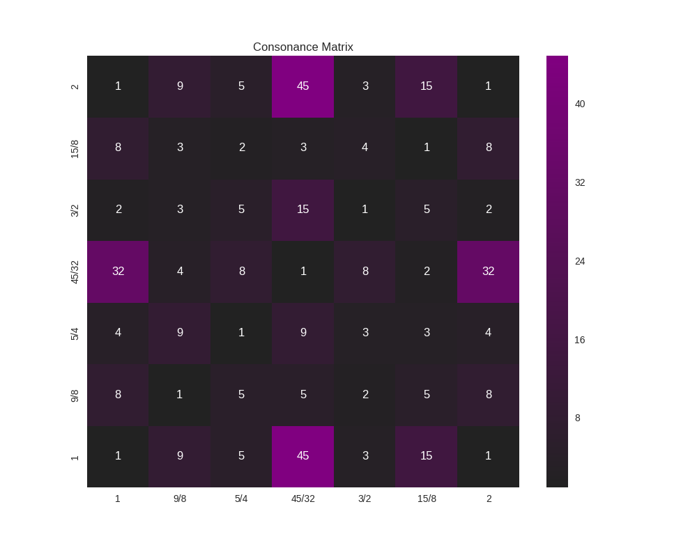
It’s nice to be able to get an intuitive feeling for the consonance or dissonance of a scale. For this, the consonance matrix is provided.
The consonance matrix forms an interval between every degree in the scale and applies a metric function to it. The default metric function just measures the denominator of the interval after any simplification it can undergo (and is really only meaningful for degrees which are expressed an integer ratios).
As an example, we can create a scale of the Euler-Fokker type:
scale = create_euler_fokker_scale([3,5],[2,1])
which is
![\left [ 1, \quad \frac{9}{8}, \quad \frac{5}{4}, \quad \frac{45}{32},
\quad \frac{3}{2}, \quad \frac{15}{8}, \quad 2\right ]](_images/math/645fe4d0a753458b467ffd89097220b32c0c453b.png)
Now, to create a consonance matrix:
from pytuning.visualizations import consonance_matrix
matrix = consonance_matrix(scale)
matrix now contains a matplotlib Figure. To write it as PNG:
matrix.savefig('consonance.png')
Which yields:
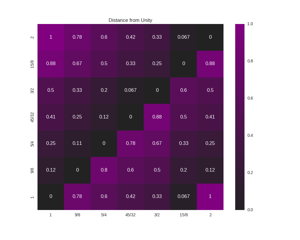
Because this function accepts an arbitrary metric, it can be used for any analysis performed on the intervals of a scale; it does not need to really be a measurement or estimate of consonance. As an example, let’s say that (for some reason) you’re interested in how far from unity each interval is:
def metric_unity(degree):
    normalized_degree = normalize_interval(degree)
    y = abs (1.0 - normalized_degree.evalf())
    return y

scale = create_euler_fokker_scale([3,5],[2,1])
matrix = consonance_matrix(scale, metric_function=metric_unity, title="Distance from Unity")
Our graph now looks like:
We could even do something like look for perfect fifths within our scale:
def metric_fifth(degree):
    p5 = sp.Rational(3,2)
    normalized_degree = normalize_interval(degree)
    y = normalize_interval(p5 / normalized_degree).evalf()
    y = y if y == 1 else 0
    return y

scale = create_euler_fokker_scale([3,5],[2,1])
matrix = consonance_matrix(scale, metric_function=metric_fifth,
  title="Relation to Perfect Fifth", annot=False)
which gives us:
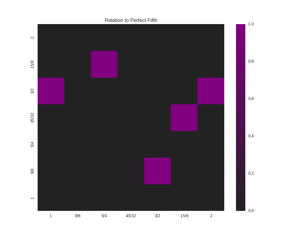
where the highlighted cells denote perfect fifths.
You’ll note that the entry for  and
and  is 1
(a perfect fifth). We can verify this:
is 1
(a perfect fifth). We can verify this:
print(normalize_interval(sp.Rational(45,32)  / sp.Rational(15,8)))
3/2
-
pytuning.visualizations.consonance_matrix(scale, metric_function=None, figsize=(10, 8), title='Consonance Matrix', annot=True, cmap=None, fig=None, vmin=None, vmax=None)¶ Display a consonance matrix for a scale
Parameters: - scale – The scale to analyze (list of frequency ratios)
- metric_function – The metric function (see below)
- figsize – Size of the figure (tuple, in inches)
- title – the graph title
- annot – If True, display the value of the metric in the grid cell
- cmap – A custom
matplotlibcolormap, if desired - fig – a
matplotlib.figure.FigureorNone. IfNonea figure will be created - vmin – If secified, the lowest value of the range to plot. Only works if Seaborn is included.
- vman – If secified, the largest value of the range to plot. Only works if Seaborn is included.
Returns: a
matplotlib.Figurefor displayThe consonance matrix is created by taking each scale degree along the bottom and left edges of a matrix, forming a frequency ratio between the left and bottom value, and applying the metric function to that value.
The default metric function is the denominator of the normalized ratio – the thought being that the smaller this number is the more consonant the interval.
If a user-specified metric function is used, that function should accept one parameter (the ratio) and return one value. As an example, the default metric function:
def metric_denom(degree):
    normalized_degree = normalize_interval(degree)
    return sympy.fraction(normalized_degree)[1]
Note that, as with most parts of this code, the ratios should be expressed in terms of
sympyvalues, usuallysympy.Rational’sA note of figures: With the default of fig=None, this function will just produce a figure and return it for display. However, if one wants to plot multiple figures and can pre-allocate it. This is useful, for example, if one wants to plot multiple figures on the same chart. As an example, the following will plot two separate consonance matrices, side-by-side:
import matplotlib.pyplot as plt
fig = plt.figure(figsize=(15,6))
plt.subplot(plt.GridSpec(1, 2)[0,0])
fig = consonance_matrix(scale,title="Full Scale", fig=fig)
plt.subplot(plt.GridSpec(1, 2)[0,1])
fig = consonance_matrix(mode_scale,title="Mode Scale", fig=fig)
fig
vminandvmaxare useful if you’re plotting multiple graphs in the same figure; they can be used to ensure that all the component graphs use the same scale, so that visually the graphs are related. Otherwise each graph will have its own scale.